Deciding the ideal content placement on the page (a.k.a. Layout) can easily become a frustrating experience. However, experienced designers already know this. They will always begin their work by first placing the foundation for the layout – the Layout Grid.
What is a layout grid?
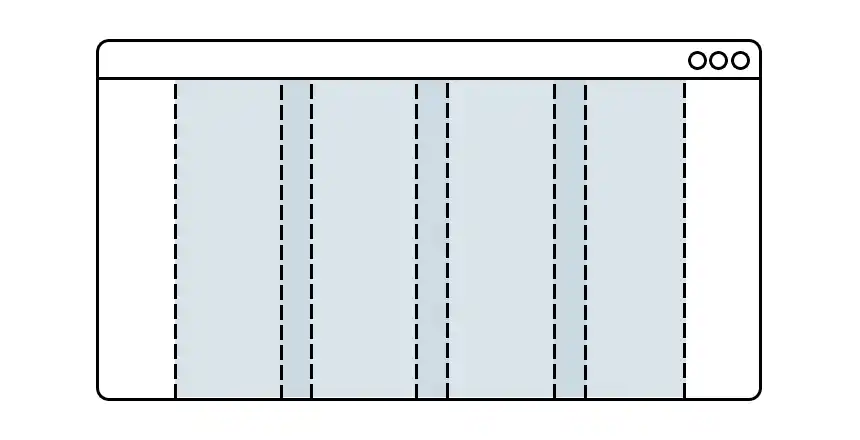
A layout grid is a system of vertical and sometimes in combination with horizontal lines that act as guiding elements for effectively arranging content blocks on the page.
The grid lines are meant to be invisible guiding lines and not a part of the content or design. But they do an excellent job of helping you make effective layout decisions with surprising ease and confidence.

Why use a layout grid?
If you have never used a layout grid before, try it; you will be surprised by how ingenious and indispensable a tool layout grid is.
Layout grid effortlessly brings order, consistency, structure, and organization to the content you present to the users. These are the qualities that you would want to achieve in your designs.

What does a layout grid bring to the table?
Layout grid is famous for speeding up and streamlining the layout design process.
Once you set the layout grid in your document as the foundation for your design, you will intuitively begin making effective decisions about the placement, alignment, size, etc. of the content blocks.
Layout grid eliminates the guesswork and random layout choices and quickly takes you towards a well-balanced layout that works well on many levels.
Well-aligned and orderly
The most obvious assistance a layout grid provides is for the alignment of content. Alignment instantly brings the qualities of order and neatness. This puts the user’s mind at ease, helping him engage with the content. Everyone will agree that well-aligned content is easy to work with.
Consistency and balance
When you decide to use a layout grid in your design, you agree to follow its rules of alignment, placement, and spacing between the individual content blocks. Because the purpose of the layout grid is to essentially create a balanced structure by dividing the page into uniformly placed columns and rows, the content placed on the grid acquires these qualities too.
Whether the page is simple and minimalist or complex and busy with content – the layout grid performs an excellent balancing act.
Can create layout variations, and visual hierarchies that are still cohesive with the main overall structural scheme
You might worry that the layout grid will force you to create a monotonous layout structure devoid of visual hierarchy or structural variations. But that is not true.
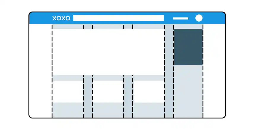
By varying the number of grid units (columns and or rows) involved in a given content block you can establish a visual hierarchy. Moreover, the visual hierarchy created within a layout grid is cohesive, as it is achieved while still operating within the basic structure of the grid.
You will notice that all the content blocks that are fitted on the layout grid, whether they are wider or narrower, bigger or smaller – still appear to be from the same family, so to speak.
Consistency of presentation across the pages, and the future pages.
When a layout grid is applied, say to a website or a book, it is applied across all the pages. Every page follows the same underlying structure. This consistency in content presentation brings a sense of familiarity which puts the users at ease.
Naturally, the layout grid will also extend its existing structure to the new pages that will be developed in the future. All the better!
Taming the chaos – in your head and on the page
Agreed, a layout grid restricts the number of ways in which content can be presented. This is the reason why beginner designers are hesitant to use the grid. But in truth, having an endless or large number of choices in how a page can be designed turns out to be a ‘pitfall’ rather than an advantage.
As a designer, you could entangle yourself while exploring endless layout combinations and, afterwards deciding which one to use. Also, it has been observed that users will not want to look at an entirely different way of presentation on every new page on the website.
Provides a common working ground for you and your dev team.
More often than not, you will be working within a team, and it is highly efficient when you – a designer, and the dev. team members have a common working ground.
The layout grid is everywhere.
The pros of using a layout grid completely outweigh its perceived drawbacks. As a result, grids are being utilized in all kinds of designs. People are now accustomed to, and comfortable with the content presented in a grid structure, whether they realize it or not.
As a designer, you can take advantage of this scenario by using a layout grid in your work and benefit from it.
Responsive web design is a standard now. It requires a grid.
As a standard requirement, websites are now designed to be responsive – where the website’s layout scheme changes according to the width of the device (desktop computer, laptop, tablet, mobile, etc.) for optimum presentation of the content, rather than keeping the same layout in all of these different devices.
Responsive web design is achieved by placing the content on top of… a grid.
Different types of layout grid
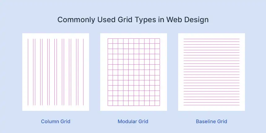
There are different types of layout grids, each providing unique applications.

You can go with one (type of) layout grid because it solves your layout challenges. You may opt for multiple, overlapping layout grids because the additional grid adds another layer of order and organization to the content that you are trying to design.
You can use nested grids – a grid inside of a grid, no problem!
Read: Types of Layout Grids
Why you might be sitting on the fence?
At the outset, students of the design jump to the hasty conclusion that the grid will restrict and stifle their design, and creativity. You may be one of them. I was too. But once I invested my time into it, and used it on several design tasks, I was all smiles.
Your hesitation towards the layout grid is borne out of your unfamiliarity with the layout grid.
Grab a grid and start using it.
Never used a layout grid before? Here! try using a column grid – 12 equal-width columns to create a sample web page layout.
- Download the grid template (jpg) (width: 1400, height: 1200px)
- Create a blank document in your choice of design software with above dimensions.
- Place the grid template as the first layer (at the bottom) in the document. Lock the layer.
- Start placing page elements on this grid to create a sample web page – logo, navigation, footer, main area, sidebar etc.
- Try to align content, apply width, and set space between the content blocks dictated by this grid.
Watch video: Using Layout Grid for Web Design


